What to Send Us: A Product Photo Checklist for Brands
In short
- One sharp, evenly lit reference photo per product is the minimum; three angles is ideal.
- Include a scale reference — a coin or ruler — for anything where size is ambiguous.
- Send the exact material and finish names; 'gold' covers a dozen different appearances.
- Any existing campaign image you like is worth more than a paragraph of description.
The brands that get excellent first sets are not the ones with the best products. They are the ones who spend ten minutes on this list.
Photos
- One sharp front-on photo of each product, whole piece visible, plain background, daylight.
- One angled photo showing depth and dimension.
- One detail photo of anything distinctive — a clasp, a setting, a stitch, an engraving.
- A scale reference if size is not obvious. A coin in frame settles it instantly.
Avoid: direct flash, coloured indoor lighting, filters, anything already retouched, and screenshots of photos. Send the original file rather than a version compressed through a chat app if you can — though we can work with what most people send.
Product facts
- Exact material and finish — "925 silver, rhodium plated" not "silver"
- Dimensions, especially for anything worn
- Stone types and cuts if relevant
- Anything that must remain accurate: hallmarks, engravings, certification marks
That last point matters. Tell us what cannot change, and it will not.
Brand direction
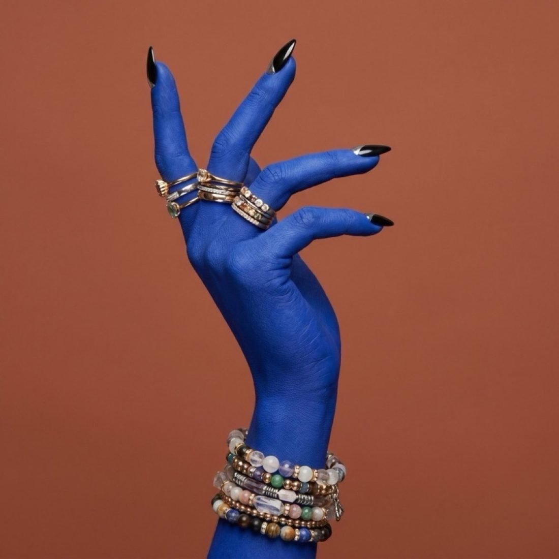
- Two or three images you like. Yours, a competitor's, a magazine page — anything. This is the single most useful thing you can send.
- Two or three you dislike, which is nearly as useful.
- Your palette, if you have one defined.
- Where the images will run: feed, Reels, marketplace, print, hoarding.
Commercial details
- How many finished images you need
- Aspect ratios required
- Deadline, and whether it is a hard launch date
- Whether this is a test or part of a larger catalogue
The one-line version
If you only do one thing: send a sharp daylight photo of the product and one campaign image you wish yours looked like. That combination alone gets most first sets close.
A ninety-second method for shooting references yourself
You do not need equipment. You need a window and a piece of paper.
- Find a window with indirect daylight. Mid-morning or mid-afternoon; avoid direct sun.
- Tape a sheet of white A3 paper to the wall and curve it onto the table to make a seamless sweep.
- Place the product roughly a metre from the window, side-on to the light.
- Hold a second sheet of white paper on the opposite side to bounce light back in. This one step fixes most dull-metal problems.
- Turn off flash, HDR and any beautification. Tap to focus on the product's key detail.
- Take four frames: front, 45 degrees, overhead, and a macro of the detail.
Ninety seconds per product. For a forty-piece catalogue that is an afternoon, and it is the most valuable asset you will build this year.
Naming and organising files
Unglamorous and genuinely important once you have a few hundred images. A convention that works: SKU_productname_angle.jpg — for example AK102_pearl-drop_front.jpg. Keep references and finished files in separate folders. When you commission work, send a single folder per product rather than loose images in a chat thread.
Brands that skip this end up re-photographing items they already documented, because nobody can find the originals.
What to tell us that you might not think to mention
- Anything that must not change — a hallmark, an engraving, a certification stamp
- Whether the piece has a "correct" orientation that a non-specialist might get wrong
- Colourways that exist but you are not sending, if you want them generated later
- Where text or logos will be overlaid, so we leave space for them
- Whether the images will ever be printed large, which changes the output resolution
The single most useful thing to send
An image you wish yours looked like. Not a description of it — the actual image. Ten words and a reference picture communicate more precisely than five hundred words of adjectives, because light, palette and mood are extremely hard to describe and trivially easy to point at.
Send both on WhatsApp and we will return one finished frame free, so you can judge the result on your own product before committing to anything.
Frequently asked
How many reference photos do you need per product?
One sharp photo is workable. Three — front, angled and detail — is ideal, and reduces revision rounds noticeably. For anything with a clasp, hinge or complex back, include that detail specifically.
Does the reference photo need to be professionally shot?
No. A phone photo in daylight is fine and is what most of our clients send. Sharpness and completeness matter; lighting quality does not, because the lighting is what we are replacing.
What if my product has a very specific colour?
Photograph it in daylight, avoid coloured indoor bulbs, and tell us the finish name — 'rose gold vermeil', 'antique brass', 'champagne satin'. If colour accuracy is critical, include a white sheet of paper in the frame as a reference point.
Want Visuals Like This for Your Brand?
Send us 1 photo of your product on WhatsApp and see a campaign-grade editorial sample transformed for free within 24 hours.
Book a Free Sample