Nine Jewellery Photography Mistakes That Cost You Sales
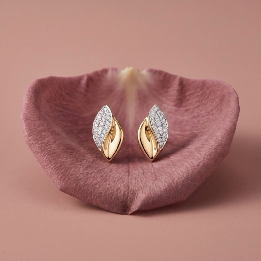
In short
- Grey-looking gold is a reflection problem, not an exposure problem.
- Missing scale reference is the single largest driver of jewellery returns.
- Over-retouching removes the texture that signals real metal.
- Inconsistent colour temperature across a catalogue makes a brand look unreliable.
We audit a lot of jewellery catalogues. These nine appear again and again, roughly in order of how much they cost.
1. The gold looks grey
The most common and the most damaging. Metal reflects; it does not have its own colour. If your gold is grey, it is faithfully reflecting a dull room. Fix: place a large bright white surface where the piece can reflect it. Do not chase it with exposure or saturation.
2. No sense of scale
A pendant photographed alone could be 8mm or 80mm. Buyers guess, guess wrong, and return. Fix: one worn shot per product, plus dimensions in millimetres in the text. This single change reduces returns more than any other.
3. Dead stones
Faceted stones lit only with soft light go grey and glassy. Fix: add one small, hard, distant light to create internal refraction. Keep the soft key for the metal.
4. Over-retouching
Metal polished to a perfect gradient in post stops looking like metal and starts looking like CGI. Real gold has micro-texture, faint tool marks, tiny imperfections. Fix: retouch defects, not character.
5. Inconsistent colour temperature
Half the catalogue shot warm, half cool. On a category page the brand looks careless. Fix: fix white balance once, apply it across the set, and check the grid as a whole rather than image by image.
6. Cluttered staging
Three props, a fabric swirl and scattered petals around a single ring. Every added element divides attention and lowers the perceived price. Fix: one hero, one supporting element, generous negative space.
7. Reflections nobody controlled
The photographer, a window, a ceiling light visible in the metal. Fix: shape reflections deliberately with cards and flags. A clean gradient along a band is the goal, not the absence of reflection.
8. Wrong crop for the platform
Square images cropped by Instagram, vertical images letterboxed on a marketplace. Fix: export each set at the ratios you actually publish — 1:1, 4:5 and 9:16 as standard.
9. One image per product
A single frame cannot answer scale, texture, fit and context simultaneously. Listings with one image convert poorly and return heavily. Fix: a minimum set of four — clean, worn, detail, context.
The audit worth doing today
Open your category page on a phone. Squint. If the pieces blur into an indistinguishable row of similar-toned objects, the problem is not any single photograph — it is that nothing in the set was designed to be seen at that size.
How to fix a catalogue you have already shot
Most of these problems can be improved without reshooting.
- Grey gold — partially recoverable in post by lifting warmth selectively in the metal and increasing local contrast. Fully solved only by re-lighting, but a targeted grade helps considerably.
- Inconsistent white balance — entirely fixable. Pick one reference image you are happy with, match every other image to it, and check them as a contact sheet rather than individually.
- Wrong crops — fixable if you have masters with margin. Re-export the ladder rather than letting platforms crop for you.
- Missing scale shots — the one gap worth addressing immediately. A worn frame per product can be generated from your existing reference photography.
- Dead stones — hard to rescue in post. This one usually needs re-capture or regeneration.
The order to fix them in
- Add scale frames to your best sellers. Highest return, directly reduces refunds.
- Normalise colour temperature across the catalogue. Cheap, and it makes the brand look coherent immediately.
- Re-export correct crops for every platform.
- Rebuild the worst-performing hero images.
- Extend to detail and context frames.
A note on retouching intensity by price point
The right amount of retouching is not constant. Mass-market jewellery tolerates and arguably benefits from heavier cleanup, because the buyer is comparing against similarly polished competitors. Fine and artisanal jewellery is damaged by it — the buyer is paying for evidence of hand-making, and a surface polished to perfection removes exactly that evidence.
If your proposition is craft, leave the tool marks in.
What good looks like in one sentence
A viewer should be able to tell, at thumbnail size, what metal it is and roughly how big it is — and at full size, should be able to see enough texture to believe a person made it.
Frequently asked
Why does my gold jewellery photograph grey?
Polished metal reflects its surroundings rather than having a colour of its own. If it is reflecting a dim room, it photographs grey. Put a large bright surface where the metal can reflect it and the gold returns, without touching your exposure settings.
How do I show the size of a ring or pendant in a photo?
Photograph it worn, or include a familiar object in one frame, and always state dimensions in millimetres in the listing text. Buyers consistently misjudge scale from photographs alone, and it is the leading cause of jewellery returns.
How much retouching is too much for jewellery?
When the metal loses its micro-texture and the stones lose their internal structure, you have gone too far. Perfectly smooth metal reads as a render, which undermines exactly the authenticity a premium buyer is paying for.
Want Visuals Like This for Your Brand?
Send us 1 photo of your product on WhatsApp and see a campaign-grade editorial sample transformed for free within 24 hours.
Book a Free Sample