Choosing the Right Background for Product Photos
In short
- White backgrounds communicate clarity and are required for marketplace primaries — but signal 'commodity' in campaign contexts.
- Dark backgrounds raise perceived value for reflective and luxury products.
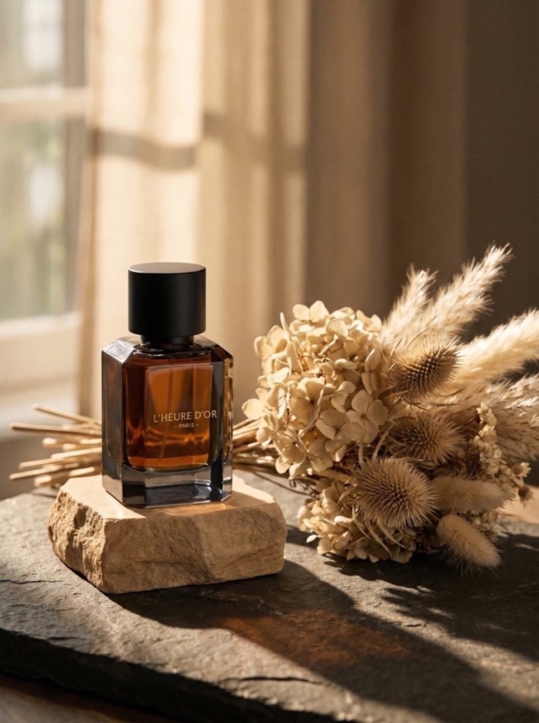
- Textured natural surfaces perform best for craft, artisanal and heritage positioning.
- The most common mistake is a background with similar tone to the product, which destroys separation.
Brands treat the background as empty space. It is not. It is roughly half of what positions the product, and it is decided before anything else in the frame.
Pure white
Says: clarity, honesty, retail.
Mandatory for marketplace primary images and genuinely the right answer there — the buyer wants unobstructed information. In any other context it is a weak choice for premium goods, because it strips away every mood signal and puts your ₹40,000 necklace in the same visual register as a phone charger.
Deep black or near-black
Says: luxury, drama, scarcity.
Strong for jewellery, watches, perfume and spirits, because it lets highlights do the storytelling — the eye reads a bright object emerging from darkness as valuable. The failure mode is edge loss, where dark parts of the product merge into the background. Solve it with a rim light along the edge, not by lifting the whole backdrop to grey.
Graduated backgrounds
Says: considered, studio-made, premium-commercial.
A subtle light-to-dark gradient gives depth without introducing content. It is the workhorse of beauty and electronics for good reason. Keep the gradient soft; a visible hard edge looks like a mistake.
Natural textures
Says: craft, heritage, handmade, earthy.
Linen, raw stone, unglazed ceramic, aged paper, weathered wood. The best choice for artisanal and heritage positioning, and particularly effective for Indian jewellery brands drawing on traditional craft — the texture carries a story the product alone cannot.
Keep the texture quiet. It should be legible at thumbnail size as "a surface", not compete as a subject.
Full context
Says: aspiration, lifestyle, belonging.
The product in a room, on a body, in a scene. Highest emotional impact, lowest information density. This is discovery imagery — it belongs in feed and campaign, not on a listing.
The mistake that undoes all of it
Insufficient tonal separation. A gold piece on a warm beige surface. A cream garment on off-white. A silver ring on light grey. The product and the background occupy the same tonal range, the edges dissolve, and at thumbnail size the image reads as a smudge.
Test it: convert the image to greyscale and shrink it to 100 pixels wide. If you cannot immediately identify the product's silhouette, the background has failed regardless of how tasteful it looked at full size.
Choosing by category
| Category | Catalogue | Campaign |
|---|---|---|
| Gold jewellery | Warm neutral grey | Linen, raw stone, deep shadow |
| Silver / white gold | Cool light grey | Slate, dark gradient |
| Apparel | White or light grey | Location or textured wall |
| Beauty | Gradient, mid-tone | Water, glass, coloured light |
| Leather goods | Warm mid-grey | Wood, stone, travel context |
| Watches | Dark gradient | Metal, glass, dramatic low key |
| Home decor | White | Full interior context |
The tonal separation rule, stated precisely
Aim for at least three stops of tonal difference between the product's dominant tone and the background. In practice: pale products on mid-to-dark grounds, dark products on light-to-mid grounds. Where the product contains both extremes — a black-and-white garment, a two-tone watch — pick the background to separate the dominant area and use a rim light to rescue the rest.
The greyscale thumbnail test is the fastest way to check this. Desaturate, shrink to 100px, and see whether the silhouette survives.
Background colour and price perception
Some broad patterns hold consistently across categories. Deep, desaturated grounds — charcoal, ink, forest — read as more expensive than bright saturated ones. Warm neutrals read as craft and heritage. Cool neutrals read as clinical and technical, which suits electronics and skincare but works against jewellery. Pure white reads as retail. Bright saturated colour reads as youthful and high-volume, which is right for some brands and fatal for others.
None of this is a rule you must follow, but each is a signal you are sending whether you intended to or not.
Consistency beats optimisation
A category page where every product sits on a slightly different background looks careless even when each individual image is good. Pick one catalogue background per category and hold it across every product. Save variation for campaign work, where each image is seen alone rather than in a grid.
Frequently asked
Is a white background always best for product photos?
For marketplace primary images, yes — it is required. Everywhere else it is a positioning choice, and usually a weak one for premium products, because it removes all mood and reads as commodity retail.
Should luxury products be photographed on black?
Dark backgrounds do tend to raise perceived value, particularly for reflective items like jewellery and watches, because they let highlights carry the image. The risk is losing product edges into the background, which is solved with a rim light rather than by lightening the backdrop.
What background works best for jewellery?
For catalogue work, a warm neutral grey. For campaign work, natural textures — linen, raw stone, aged paper — which read as craft and heritage. Avoid glossy black acrylic unless you can control the reflections it creates.
Want Visuals Like This for Your Brand?
Send us 1 photo of your product on WhatsApp and see a campaign-grade editorial sample transformed for free within 24 hours.
Book a Free Sample